last updated:
Voltage’s Favorite: Scientific Color Maps
I do a bunch of science, and so I've become partial to a few particular color schemes. These are them.
Quick Jump
Batlow, Carmeri

Batlow is my go-to colorbar color scheme at this point. I read the paper that Crameri et. al published regarding accessibility in sciences and the theory that goes into choosing color scales, which blew me away. I hadn't been considering the colors that I had been using in my charts up until very recently, and even then, not to this degree. I have since gone and made sure that my Chronology plot has colors that align with this clor scheme as best they can. As of late April '25, the next time i update that chart, I will make sure that the batlow color scheme (or a similar one like BatlowK) is in use.
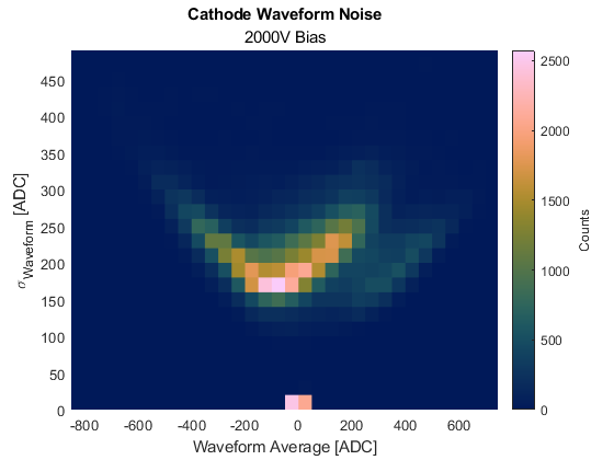
Here's a cool chart to demonstrate!
This color scheme is designed to be accesibile for people with multiple types of color blindness. I'm oging to be so honest, I had no idea that there were more than like two or three types, but it goes to hsow that you can always be learning, huh? But the thing about this color scheme that also works super well is that it is designed to clearly demonstrate incrementations in both hue and brightness, meaning that you'll always be able to tell where the data is relative to the thigns surrounding it, so long as you understand how colors work. This also means that if you were to look at a grayscale version of a plot using batlow, you'd still be able to generally tell the datatrends, and isn't that really the point of a colorbar? Imagine having an x-axis that increments ununiformly. What a useless plot that would be. This is why it's worth reviewing some artistic accessibility studies every so often (and why we need to make science more generally accesible).