My Gaming Life in Numbers

A Discussion
I'm kind of obsessed with this plot.
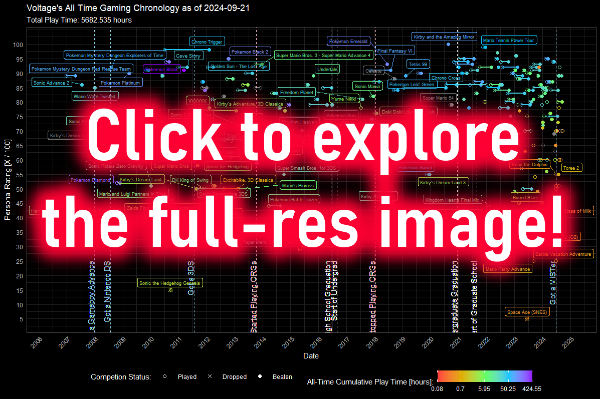
This is my entire gaming history, just a bunch of dots and lines. Each set, a video game I chose to play (that I have tangible data for, of course). In a way, this is my entire life from age 8 onward. These dots tell stories, their densities tell when I had time to play, when I didn't. I can point to major moments in my life, some visible in this plot with varying degrees of obviousness. My College Graduation is visible on this plot, as is when I got my Nintendo 3DS. If you know a little more about me, you might be able to explain why I suddenly stopped playing games around Fall 2013. Maybe you'll find out!
This plot is a representation of my life through little more than numbers.
I wouldn't say I obsessively recorded my gaming data, it sort of just happened. I got games as a kid on monumental days like birthdays and Christmas. I played games during holidays or in strange circumstances, the context of each imprinting in my memory parallel to the events of Easter 2011 (playing
In general, the dates of a lot of these games are later simply because I don't have the evidence to prove I played a game on a pecific date. The biggest example is the previously mentioned Amazing Mirror. While I know *FOR A FACT* that I played the game as a kid, icouldn't tel lyou dates, or for how long I played. The fact reality of the situation is that I don't have that data, and I don't want to fudge the numbers. I want this plot to be as accurate and honest as possible, because I myself want to be as accurate and honest as possible.
I'm still thinking about ways I can improve this plot. Ways I can backfill any data I might be able to find. There are some games I've played that aren't on this plot because I haven't given them a numerical rating. I might eventualy backfill these as well, but if I do so, I want the personal ratings I give these games to be honest and accurate about how I feel about them. It's hrad to know how I feel about a game if I only play it for at most fifteen minutes.
If you're curious about why a certain point is higher or lower on the vertical axis, please read "On Rating and Bias"!
Okay, but this is just a bunch of dots and lines, which games are they?
I'm glad you asked!
You can click on the image at the top of the page to see the full-sized image, OR YOU CAN CLICK HERE! (it's big !)
Click me to download the .csv data!
Specific Changes / Updates:
November 26, 2024
A couple noticeable changes:
- Added a marker for present day (as of the making of the list)
- Added a marker for my current playthrouhgs, include a star and a dashed line from the start date. You can see this Dragon Quest 5, for example.
- Adjusted the color more to be more "scientific" per Crameri et. al.
September 28, 2024
Changed the color scale to be a little nicer, based on a few papers I've read. I'm not quite satisfied with this since it's really diffficult to tell the difference betweenn a game I played for 5 hours, vs. 50 hours vs. 500 hours. I intend to find a way to make the color scale distribution be better about showing this, since I think that it's crucial in showing how significant some of these outliers are. Maybe I almost wonder if I should just do an entire segmented color bar? I'll figure out what works best here.
Otherwise, I've just added a few more games from last week as well as a few other older ones I have data for that I found!
September 21, 2024
I'm excited to have this page back up! Long-time visitors might have seen something like this earlier, but I wanted to revamp the graph a bit to capture the entire chrnonology in a readable way. That means I now have a working image that you can explore! It's very big! I intend to make small tweaks to the dataset long term, including figuring out how I want to account for "replays" and initial playthroughs. For example, some games that are very highly rated are games that are ORIGINALLY from periods of time wel-before they're charted here. If I can find data that supports my "iinitial play" and any specific dates of specific replays, I will definitely be retconning these data points to reflect more accurate dates. I also want to backfill things more in general, but I need to be honest about the information. What's the pointof this chart if all of it's just made up? I also am looking into altering the colors to better emphasize the logarithmic scale for total play time. It's funny, I'm actually reading some papers on this, so you might see a major style overhaul in the next few updates. We'll see soon enough for sure.